
My Role
UX Designer, UX Researcher
Timeline
Dec 2021 - Jun 2022
The Challenge
U.S. consumers are not well acquainted with tea
Despite its history, variety, and health benefits, tea is not as popular in the U.S. as other foods with similarly rich histories. Foods like wine, cheese, coffee, and beer, by comparison, have a stronger presence in the market to this day. This led to the question: how might an app help change this trend? More specifically, how might an app help make people better acquainted with tea and more likely to make it a regular part of their lives?
The Solution
Focus first on the needs of early users

Learn
Search for tea by features like type, caffeine level, and origin.
Access information on a tea’s background, health benefits, flavor, and preparation.


Expand
Explore shops in your area that sell or serve tea.
Access topics like tea history and how to use tea in a variety of recipes.

Connect
Find tea-related events in your area.
Link up with groups for discussions or in-person activities.

Academic Research
Key point: different waves of users have different needs
When looking into what drives people to adopt new ideas or products, I found that one of the main social science theories stresses the importance of appealing to the needs of different waves of users—from the earliest trend setters to the late comers.
The main ways of winning over both the earliest users and the larger majority that follows them include:
showing the benefits
providing clear instructions and guides
highlighting the other people that already joined in
Other academic research further backs the importance of showing users they’re not alone when venturing into the world of a new or innovative product. According to this research, even in the online world, “the mere presence of others…will lead to a higher willingness to [try] innovative products.”
Initial Interviews
Interviewees touched on themes similar to those in the academic literature
To learn more about potential users, I scheduled a series of semi-structured interviews. The interviewees were all working adults residing in different parts of the U.S. Most of them had minimal exposure to tea and were not habitual tea-drinkers. My hypothesis was that this sample would give me a good collective picture of my target users, which I could later turn into user personas.
A few consistent themes emerged when I analyzed the data:
The larger community plays a big part in opening up users to new products, as well as keeping them interested
Users tend to view a new product through the lens of their particular interests, hobbies, or concerns. Interviewees brought up topics like time management, quality time with others, health, food exploration, learning, and mental focus.
Good visuals are crucial for easing new users into a product. Across the board, interviewees brought up the importance of clear, appealing visuals when considering what a new product can offer.
User Personas
The potential trailblazers of tea
After analyzing my initial user interviews, I created the following user personas to help guide my design.


Competitive Analysis
Limited function & limited connection
Looking into some of the most popular tea-themed apps available, I found that none of them seemed to combine the elements needed to attract new users and reach a majority of the population. In particular, the extent to which these apps tried to connect the user to a larger community—whether online or in-person—was very limited.

Main Takeaways
Three guiding themes
Looking at where the different parts of my research align, I arrived at three main takeaways. These represent what a gateway experience for tea should focus on:

Instruction
Present clear and visually-appealing information on how to prepare and use tea

Benefits
Showcase different benefits that tea might provide for different kinds of users

Community
Highlight the larger tea-drinking community make it easy for the user to connect
Ideation
From sketchbook to low-fidelity
I experimented with rapid sketches, trying out different ideas based on the data points I’d gathered. After deciding on a basic set features and information architecture, I went on to produce a set of low-fidelity wireframes.


Want to see the entire low-fidelity wireframe flow?
Tests & Iterations
Four main design improvements
I conducted two rounds of user testing and iteration. Each round of testing consisted of seven structured user tests via Zoom. The data from these tests allowed me to confirm that my design was moving in the right direction. This included changes to the UI, information architecture, and app features.

More Ways to Connect
Added two additional sections: Community and Events
Based on users’ desire for more shared experiences, both on and offline.


Reorganized Longer Content
Pages with longer written content were placed in a Blog section.
Provides a more intuitive way for users to find longer content, like recipes, news, and various kinds of articles.


Easier to Manage Favorites
Each item in the Favorites section can be directly removed by tapping its respective heart icon
Reduces user flow friction by cutting the number of steps needed to manage Favorites


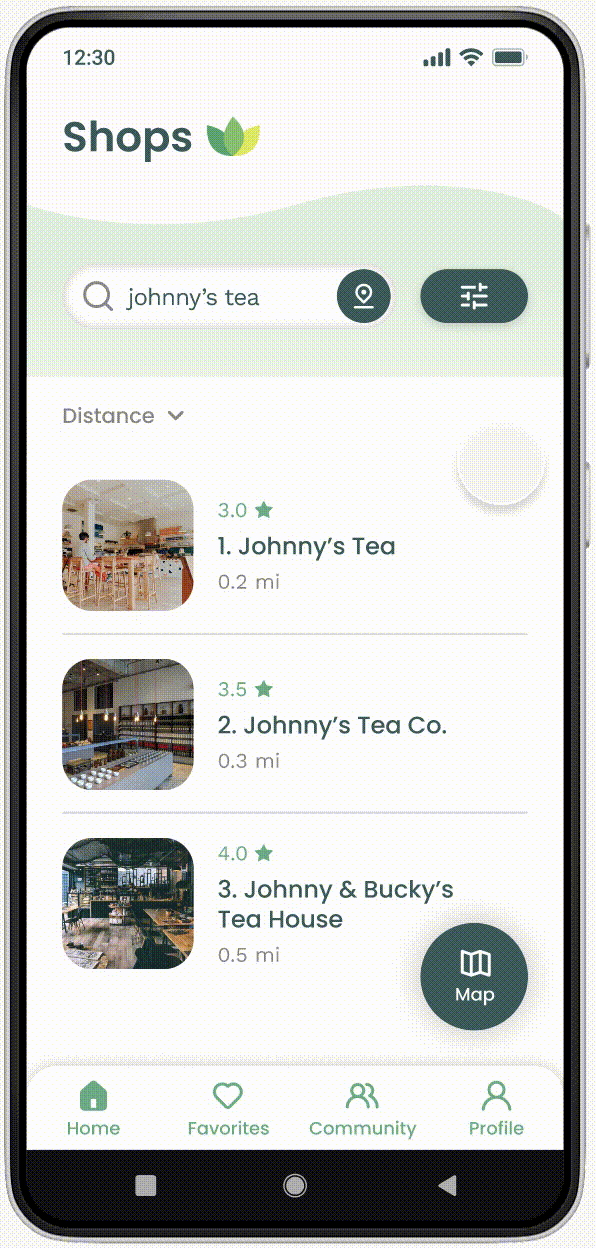
A More Noticeable Location Button
Enlarged the location button and matched the style of the filter button
Based on users being quickly drawn to the filter button, but having trouble spotting the location button.

The Final Design
High-fidelity screens


Figma prototype
Style Guide

Conclusion & Reflection
The pros and cons of self-direction
My goal with this solo project was to go through the process of making a UX case study, using my own idea for an app. I wanted a challenge, but also something that would stoke my creative flare. Hence, I chose something that’s been a big part of my day to day life since I was very young—tea!
One one hand, working on a self-directed project made parts of the process more streamlined, as I was the only decision-maker involved. On the other hand, there were many times where I clearly saw the immense value of having a team that could provide fresh ideas, point out the unseen pitfalls, and keep the project from steering off course.
The main things I would do differently
More interviews and testing in the earlier stages. Although I did a good amount of interviewing and testing before the project reached the high-fidelity stage, I still wish I would have done more. In particular, there were two major app features I added based on strong feedback that came out during the latter testing. Even if it’s normal for these kinds of late changes to happen occasionally, I was left wondering if perhaps I could’ve caught on to them with more thorough interviews.
Give more priority to creative workshopping. I started by laying out a vision for the UI style I wanted, and was mostly able to stick to it. However, as I went further into new iterations, I started running into more and more situations where function clashed with style. For example, a certain color palette combination that had worked previously no longer seemed to work with a new button layout. Eventually, I had to call a time out and do a more thorough creative workshop with the help of a mentor, which was a huge help. For future projects, I would like to do similar creative workshopping, as well as accessibility testing, earlier in the design process.
More research on how others have solved similar challenges. One of the major challenges I grappled with was how to fit all the functions I wanted into a particular page, or even a particular space. For example, I ran into this issue with pages that were meant to run searches, display detailed results, filter those results, and then provide the option of switching to a map view. Even though several of my solutions were inspired by researching how other designers solved similar challenges, I think having more preliminary research under my belt would have saved me some time.